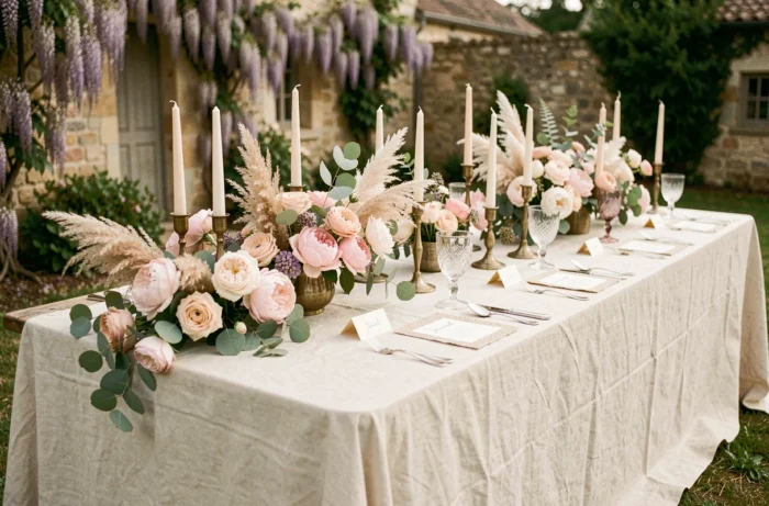
The visual coherence of a wedding hinges on details that most couples decide on too late: the choice of supporting materials, the management of natural light according to the venue’s orientation, and the hierarchy of volumes on the tables. Before even discussing themes or palettes, these three technical parameters dictate the rest of the decoration.
Supporting materials and textile coherence in wedding decoration
We recommend locking in the choice of materials before selecting colors. A wedding that mixes washed linen, satin, and shiny polyester on the same table creates a disjointed effect, regardless of the care taken with the rest.
The textile sets the level of formality for the whole. A cotton gauze table runner leans towards bohemian; a thick, unpressed linen tablecloth anchors in high-end rustic; an ivory satin pushes towards classic. Mixing two textile registers in the same space (ceremony, cocktail, reception) works, but three create visual confusion.
Raw wood, stoneware, brushed brass, and blown glass remain the most versatile materials. They adapt to both warm and cool palettes and photograph well, which is important for dinner shots in artificial light. In contrast, plexiglass and mirrors, which are very present on social media, pose a problem with distracting reflections whenever candles or LED garlands are used.
For those looking to structure their selection, it is possible to discover decoration on Mariage et Mariages to compare material associations by reception style.

Wedding color palette: building a swatch that lasts all day
A wedding palette is not limited to two main colors. We systematically work on a four-level system: a neutral dominant (linen, cream, off-white), a signature color, an accent shade, and a metal.
The signature color occupies about a third of the visible textile surfaces (napkins, ribbons, chair cushions). The accent shade appears in touches on stationery, centerpieces, and possibly the bridal party’s outfits. The metal (gold, copper, silver) ties everything together.
The common pitfall: choosing your palette on screen without testing samples in the venue’s natural light. A stunning terracotta under warm LED lighting can turn into a dirty pink under the neon lights of a banquet hall. We advise requesting access to the venue at the time of the dinner to validate the shades in real conditions.
Trendy colors that work in room decoration
- Mocha and hazelnut tones, paired with a copper metal, create a cozy atmosphere suitable for autumn and winter receptions in stone venues.
- Sage green combined with creamy white and touches of brass remains a safe bet for green weddings, without falling into rustic clichés.
- Plum and burgundy shades, long confined to winter weddings, also work in summer when tempered by ecru linen and fresh foliage.
Table scenography: volumes and centerpieces that change the reception
The wedding table is the longest visual contact point of the day. Guests spend several hours there, meaning every detail will be closely observed. A successful centerpiece plays on three different heights.
The first level remains at tablecloth height: tea lights, small low floral arrangements, stationery elements. The second is at the eye level of seated guests, between twenty and thirty centimeters: cylindrical vases, candlesticks, medium flower arrangements. The third exceeds the line of sight, above head height: tall candelabras, hanging greenery, pedestal arrangements.
The most common mistake is to fill only the middle level, creating a visual wall between guests facing each other. A centerpiece should allow for visual contact between guests. If the arrangement blocks the view at eye level, it hinders conversation and ends up being moved to the end of the table before dessert.

Wedding flowers: fresh, dried, or a mix of both
Dried flowers have taken a significant place in wedding decoration in recent years. Pampas grass, everlasting flowers, thistles, statice: they offer the advantage of being prepared weeks in advance and withstand heat without wilting.
Their technical limitation: they emit no fragrance and produce a more matte photographic rendering. For a summer outdoor wedding, a mix of seasonal fresh flowers (peonies, dahlias, garden roses) and a few dried elements allows for a combination of lively texture and simplified logistics.
Seating plan and circulation: an underestimated decorative lever
The seating plan is not just a logistical tool. The arrangement of tables in the room conditions the perception of space and the overall atmosphere. Round tables create intimate islands, while long tables establish a banquet dynamic.
We observe that U or T configurations, long neglected, are returning in vintage or family-style weddings. They foster a sense of conviviality and allow for a reduction in the number of centerpieces, thus lowering the floral budget.
- For a narrow rectangular room, prefer two long parallel tables rather than eight round tables that congest circulation.
- Ensure a clear space of at least two meters around the buffet or dessert to avoid bottlenecks.
- Hanging string lights in a crisscross pattern above the tables compensate for a ceiling that is too high and visually brings the volume to a warmer scale.
The decoration of a wedding is not just about choosing between bohemian and chic. It is a scenographic work where every material, every height of composition, and every square meter of circulation plays a role. Couples who lock in these technical fundamentals before getting lost in Pinterest inspirations achieve a more coherent, more photographable, and, above all, more enjoyable experience for their guests.